Reimagining Layout Configurations - Story

“This Isn’t Working. It’s Too Complex!”
The words echoed through the meeting room. Our users were frustrated, and stakeholders unimpressed. The Advanced Search Layout Configuration—a crucial part of the product—was anything but advanced. It was overwhelming.
The Problems We Uncovered
Key Issues Identified
After reviewing the existing experience, trying to configure it ourselves, and speaking with functional consultants, several issues became apparent:
Scattered Fields – Fields were scattered without clear grouping, making navigation difficult.
Hidden Actions – Critical buttons like "Save" were often hidden due to horizontal scrolling.
Confusing Labels – Many labels didn't align with user expectations.
Steep Learning Curve – Even seasoned consultants struggled to use the interface efficiently.
These pain points highlighted the need for a more intuitive and user-friendly solution.

A Last-Minute Breakthrough
How Inspiration Struck
At the last moment, while preparing a presentation of our earlier solutions for the leadership team, something clicked. We had already explored different solutions, but none felt quite right. As I arranged slides, it suddenly struck me—creating a presentation felt very similar to configuring an Advanced Search Layout.
Think about it:
Selecting Slides mirrored selecting fields.
Arranging Elements aligned with organizing layouts.
Choosing Predefined Themes resembled applying saved configurations.
This realization led to a new idea—why not apply these familiar principles to our design?

Reimagining the Experience
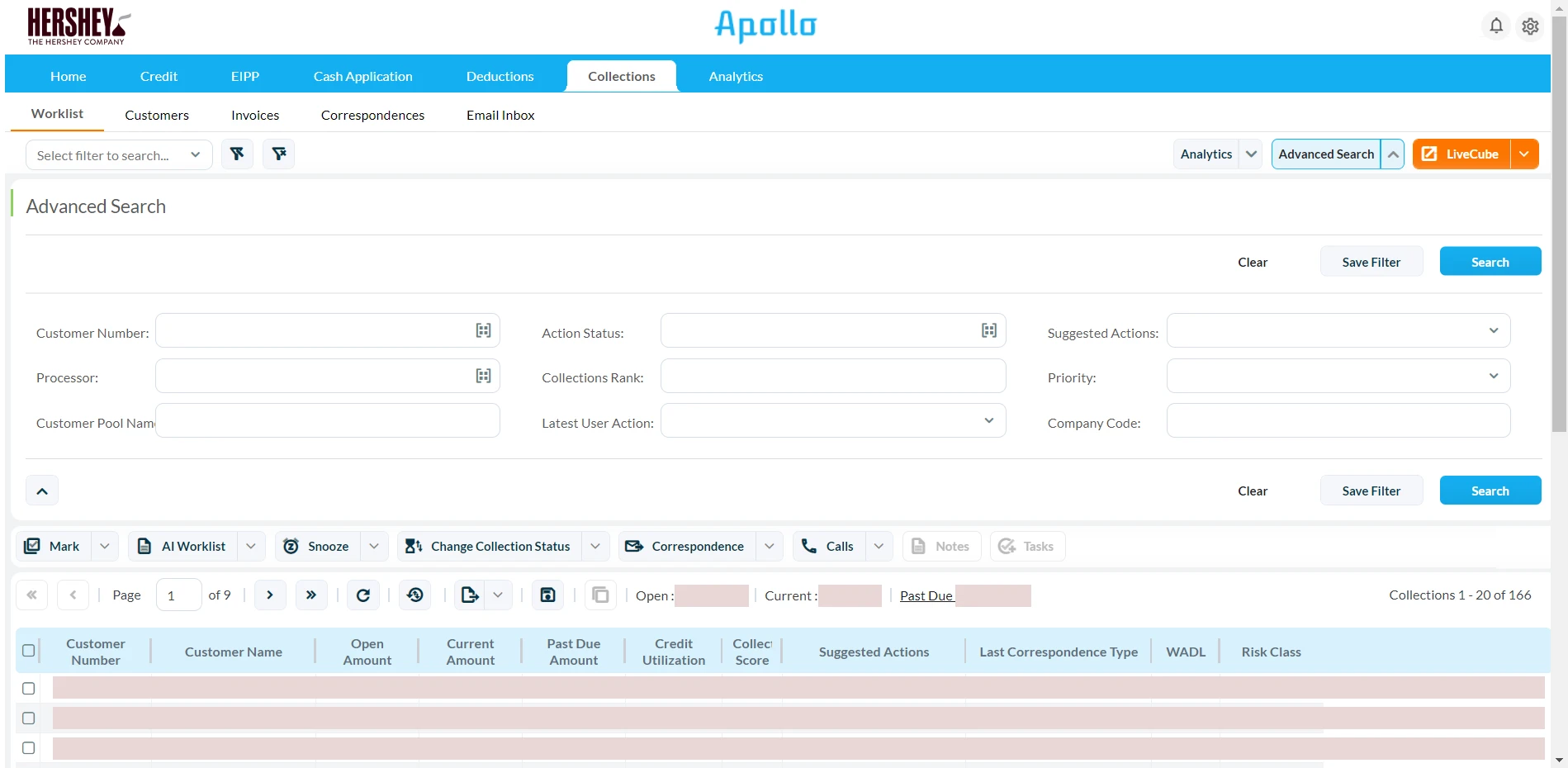
Before diving into the solution, it’s important to understand the end goal. Once a consultant configures the layout, the final output is what the end-user interacts with—the Advanced Search Panel. This panel reflects the applied layout settings and ensures a meaningful search experience.
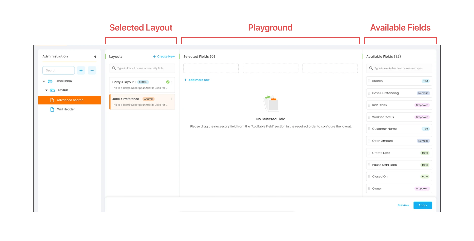
With that inspiration, we proposed a modular approach to simplify layout configuration:
Key Design Improvements
Organized Information Hierarchy: Grouped fields logically for clarity.
Inline Guidance: Contextual tooltips to minimize training needs.
Live Preview: Users could instantly see changes before saving.
Persistent Actions: Ensure key actions like saving remained visible.
Scalability and Approval
When we presented our solution to the leadership team and key functional consultants, the response was overwhelmingly positive. They immediately recognized the potential of our approach—not just for Advanced Search Layout Configuration but for other configuration-heavy areas as well.
Encouraged by the leadership’s enthusiasm, the same principles were extended to various other features, such as data table configurations with conditions and other layout-based configurations, proving that our design was highly scalable and adaptable.
The Final Outcome
After implementation, we achieved these results based on feedback from the functional consultants and internal teams:
40% reduction in time taken for configurations.
30% fewer support tickets for configuration-related issues.
Increased satisfaction among functional consultants.
Additionally, a comparison of the before and after UI demonstrates the transformation:
Previous Layout
Proposed Layout

Key Takeaways
This project reinforced a powerful realization—solutions often exist around us; we just need to recognize them. Inspiration can come from anywhere, even something as simple as preparing a presentation. Many challenges in UX aren’t entirely new, and often, a well-designed solution in another domain can be adapted effectively.
Would I do anything differently? Perhaps start usability testing even earlier. But one thing’s for sure: By staying observant and open to inspiration, we can solve even the most complex problems in ways we never initially imagined. The biggest lesson? Users don’t want features. They want clarity.
Prototype
Explore the interactive prototype to experience the design in action:
View Interactive Prototype Here
A Note on Visuals
As this is a legacy enterprise product, the visuals prioritize functionality over aesthetics. The focus of this redesign was on improving usability, efficiency, and scalability rather than purely visual enhancements.
Thank You!
Thank you for taking the time to go through this case study. I hope this gives you a clear understanding of the thought process, challenges, and solutions that shaped this project. If you have any feedback or would like to discuss further, feel free to reach out!
Users don’t want features always. Sometimes they just want clarity. :)

